Logos are more than just visual symbols—they are powerful tools designed to convey meaning, evoke emotions, and leave lasting impressions. Some of the world’s most famous logos go a step further by hiding clever details within their designs, adding layers of meaning that often go unnoticed at first glance. From subtle nods to company history to visual puns that speak directly to the brand’s purpose, these hidden elements make logos more memorable and intriguing. Understanding these hidden meanings not only highlights the creativity behind the designs but also deepens our appreciation for the thought and strategy that go into branding.
In this list of 20 famous logos with hidden meanings, you’ll discover how some of the world’s most iconic brands have mastered the art of visual storytelling. For instance, the arrow in the Amazon logo symbolizes the company’s wide range of products, spanning "A to Z," while the FedEx logo’s iconic arrow hidden between the "E" and "X" represents speed and precision. Other logos, like Baskin-Robbins and Toyota, cleverly embed their brand stories into their designs. These hidden gems are a testament to how a simple design can communicate complex ideas, making them a fascinating study for anyone interested in the art of branding.
#1. Beats
"Many people praise their products, but did you know the ‘b’ in their logo cleverly represents the profile of a person wearing headphones?"
#2. Baskin Robbins
"Baskin Robbins, the famous ice cream chain, cleverly uses colors in their logo to highlight the number ‘31’ within the letters ‘B’ and ‘R,’ symbolizing their promise of 31 delicious flavors."
#3. Audi
"Audi’s iconic logo, featuring four interlocking rings, symbolizes the union of four automobile manufacturers that came together to form the Audi brand."
#4. LG
"LG’s logo cleverly incorporates the letters ‘L’ and ‘G’ within the circle, but what many people overlook is the face they create—the ‘L’ forms the nose, while the ‘G’ shapes the rest of the face."
#5. Adidas
"Adidas’ logo is a well-known symbol in the sports world, but its three lines above the brand name represent a mountain. This design symbolizes the challenges and obstacles athletes must overcome in their journey to success."
#6. Yoga Australia
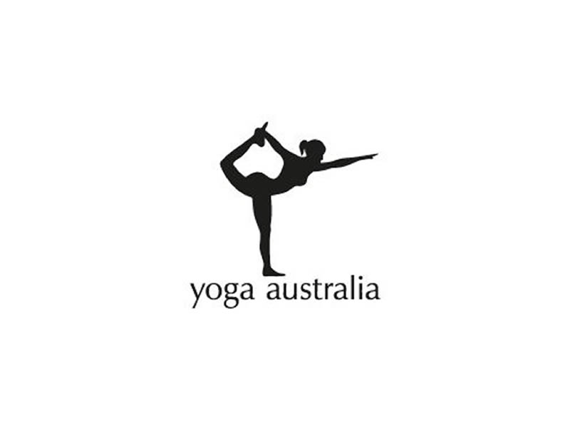
"Yoga Australia’s original logo contains a hidden gem: the space between the figure’s arm and leg subtly forms the shape of Australia."
#7. Hershey’s Kisses
"Hershey’s Kisses is known for its iconic chocolate shape, but did you notice that the space between the ‘K’ and ‘I’ in ‘kisses’ cleverly forms the shape of one of their signature chocolates?"
#8. Kölner Zoo
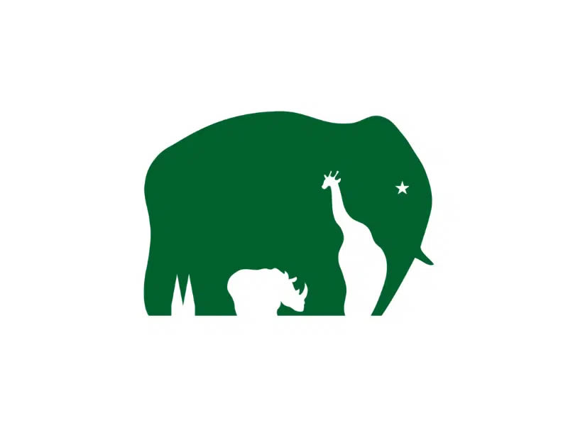
"Another excellent use of negative space is seen in the Kölner Zoo logo, where a giraffe and a rhino are cleverly shaped within the elephant figure."
#9. Carrefour
"In French, ‘Carrefour’ means intersection, and this is reflected in their logo, where two arrows suggest a right or left turn. Hidden within the design is the shape of the letter ‘C,’ visible when you focus on the negative space."
#10. New Man
"New Man’s logo is designed to be read upside down! Step back, and you’ll notice a bow tie shape formed by the letters ‘N’ and ‘M’ on each line."
#11. Eight
"This design company showcases its creativity in its logo, where each letter is crafted from a section of the number eight."
#12. Hope for African Children Initiative

"At first, this logo appears to depict the shape of the African continent. However, upon closer inspection, you can spot the outline of a child and their mother, symbolizing the foundation’s mission to unite them."
#13. Sony Vaio
"Sony Vaio cleverly blends analog and digital technology in its logo, with the ‘V’ and ‘A’ symbolizing an analog wave, and the ‘I’ and ‘O’ representing the binary code of the digital world."
#14. Tostitos
"Tostitos’ logo features a playful and clever design, with the two ‘T’s in the center resembling two people dipping a tortilla chip into a bowl, placed on top of the ‘I’."
#15. Cisco
"Founded in San Francisco, this sound company honors its hometown by incorporating the two towers of the Golden Gate Bridge into its logo. The outline of the design also subtly resembles sound waves."
#16. BMW
"While many believe the two-colored squares in BMW’s logo represent a propeller, reflecting the company’s history in airplane engine manufacturing, they actually symbolize the flag of Bavaria, where BMW originated."
#17. Toblerone
"Toblerone’s iconic mountain is instantly recognizable, but many overlook a hidden detail. If you look closely, you’ll spot a bear within the mountain, representing the city of Bern, where Toblerone was created."
#18. FedEx
"Shipping giant FedEx cleverly hides an arrow between the letters ‘E’ and ‘X’ in its logo, symbolizing the speed and efficiency with which it delivers to customers."
#19. Amazon
"Amazon’s logo features an arrow that not only forms a smile, symbolizing customer satisfaction, but also links the ‘A’ to the ‘Z’, signifying that they offer products from A to Z."
#20. Tour de France
"The Tour de France logo creatively uses letters to form an image. The ‘O’ in ‘Tour,’ along with the yellow circle, forms the shape of a bicycle, while the ‘R’ is designed to resemble a bike rider."
Conclusion
The hidden meanings in these 20 famous logos remind us that great design is about more than just aesthetics—it’s about storytelling, creativity, and connection. These clever details, often subtle and easy to miss, add depth to the logos and make them more memorable, reinforcing the brands’ identities in unique ways. Whether it’s a visual pun, a nod to the brand’s history, or a symbolic representation of its values, these hidden elements showcase the power of thoughtful design. The next time you see a familiar logo, take a closer look—you might just uncover a hidden meaning you hadn’t noticed before!

